This checklist, which Michigan State University has graciously allowed John Carroll University to utilize, is intended to be a starting point for making documents and websites accessible, and should be used in conjunction with the other materials and trainings offered. This checklist is a summary of common accessibility issues; the University requires full compliance with Web Content Accessibility Guidelines (WCAG) 2.0. If you have questions, please ask Student Accessibility Services, Integrated Marketing and Communications or the IT Helpdesk.
Text and Contrast
 Check that text has a strong contrast against the page background. Providing enough contrast between text and the background enables content to be read by those with moderate visual impairments and in low light conditions. It’s recommended to use black text on a white background.
Rationale: Contrasting colors text and background colors make the text more readable for color-blind and low-vision users.
Text Styles
 Use more than color to denote differences, emphasis, and content meaning. In addition to contrasting colors, consider adding text, shapes, and patterns.
Rationale: This helps color-blind and low-vision users recognize where you are emphasizing specific text.
Heading Styles
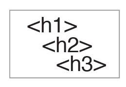 Use descriptive heading styles to designate content organization. Using headings (e.g., Heading 1, Heading 2) indicates the hierarchy of content. Predefined style headings in text editors allow readers to more clearly understand the structure of your document or web page. On long pages of content, consider using a table of contents to help readers jump more quickly between headings.
Rationale: Screen readers have to be given instructions to know which content is most important and how it should be organized. Headings provide screen readers with this information and help users with visual impairments navigate through your content more quickly.
List Styles
 Use bulleted or numbered list styles to denote list structure. This also ensures consistent formatting and helps screen readers understand content structure and organization.
Rationale: Screen readers have to be given instructions to know how to organize content. Formatting lists provides screen readers with this information and helps users with visual impairments navigate through your content more quickly.
Alternative Text
 Provide alternative text (“alt text”) for images, graphs, and charts. Descriptive alt text explains what is being illustrated and is read when using non-visual browsers. If images are decorative and don’t directly relate to the content, add that information to the alt text.
Rationale: Screen readers “read” the images, graphs, and charts using the alternative text that you have provided. This explains the purpose of your image, graph, or chart to users with visual impairments.
Multiple Avenues for Multimedia
 Supply multiple avenues for multimedia content (e.g., audio with a transcript, video with captioning). Video, audio, and interactive media requires captioning or an alternative method to deliver the same information.
Rationale: Captions and transcripts benefit a wide variety of users, including non-native speakers, users with hearing impairments, and users in sound-sensitive environments.
Added Context
 Use descriptive titles, headers, and link text to provide added context. Link text describes what you are linking to, which helps readers scan and anticipate where they will go when clicking a link. Link text like “Click here” provides little context to where the link is actually going. Do not solely rely on references to shape, size, or position to describe content.
Rationale: Descriptive link text also provides the main context for screen readers. Screen readers linearize content and do not communicate all aspects of shape, size, or position of visual elements.
Tables
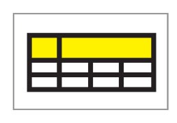 Format and use simple tables with column and row headers. Split nested tables up into simple tables, and don’t use tables to control layout.
Rationale: Complex tables can be difficult for readers to follow and comprehend, especially for screen reader users who have to remember the headers.
Other Considerations
While part of WCAG 2.0 guidelines, these best practices may also make sense to implement.
Capitalization
Use capitalization sparingly. Capitalizing all letters in a word or sentence can be visually difficult to read, and it causes a screen reader to read each individual letter instead of the word.
External Links
Any text, media, or activities that you provide from an external website or resource should be accessible.
Keyboard Navigable Content
Make sure content can be navigated via a keyboard. Keyboard navigation is the primary means used for navigating content on a web page by users who have visual or mobility impairments.